Daedalus Coaching
Building a Brand for a Tech Founder Coaching Platform
Daedalus Coaching helps tech founders navigate the journey from innovation to product-market fit.
As the business evolved, the brand needed to clearly communicate its role as a guide for founders navigating complex product and growth challenges.
The Challenge
The business had strong expertise but lacked a clear brand and narrative.
The goal was to translate Daedalus’ coaching philosophy into a visual identity and messaging system that communicates clarity, confidence, and direction.

The Approach
The project focused on building a brand that positions Daedalus as a guide for ambitious founders.
This included:
• defining the brand narrative
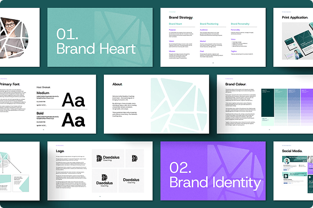
• designing a flexible visual identity system
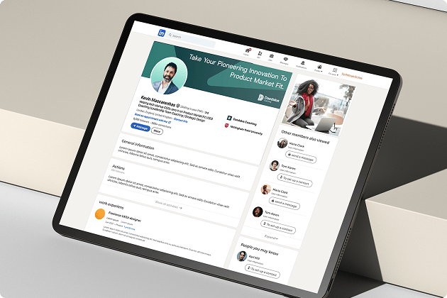
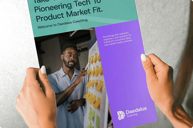
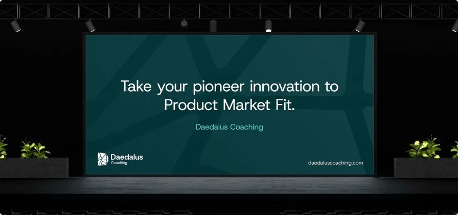
• creating marketing assets and social media templates
The objective was to create a brand that simplifies complexity while reinforcing Daedalus’ role as a trusted strategic partner.
Brand System
The identity is built around a geometric mark inspired by the Daedalus myth, symbolising guidance through complexity.
A bold yet calm colour palette reinforces clarity and confidence, while the visual system creates consistency across presentations, social media, and marketing materials.

Outcome
The result is a clear and scalable brand system that communicates Daedalus Coaching’s role as a guide for founders navigating the path to product-market fit.
The new identity provides a strong foundation for communicating with ambitious tech founders across digital and marketing channels.